We’ve covered Laurent Ferrier extensively in the past, highlighting most of what they have to offer and often in praise of what the manufacture is doing. And while today we are doing just that, what we are looking at is a little different in terms of the design direction Laurent Ferrier has taken. Introduced at SIHH at the start of this year was the Boréal range.
Galet Square Boréal
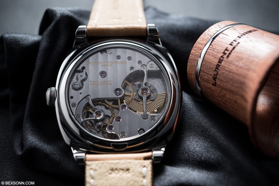
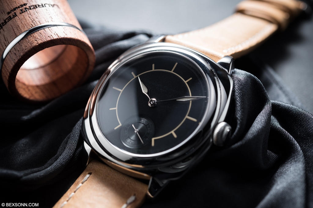 The Galet Square Boréal is no different to any other Galet Square we’ve covered in the past, with the same micro rotor FBN 229.01 movement- the first in-house movement developed by Laurent Ferrier with a double direct impulse escapement and two escape wheels. The difference of course, is in the dial and the hands. This is a big change from the Laurent Ferrier we have gotten used to, parting with an arguably conservative classical style and creating a design that fuses a stronger sense of modernity. The dial is essentially a sector dial, which is typically a classic style, with thicker and bolder lines and rounded edges, filled with super-luminova adding a futuristic element to it.
 Furthermore, gone are the ‘assegai’ shaped hands, replaced with the bolder arrow shaped hands that creates a nice uniformity throughout. The grey dial is vertically satin brushed with the manufactures logo applied in black, adding subtlety to balance out the loudness of the sector. I do prefer this as I feel the added complication gives an added depth to the aesthetic of the watch, where as with the Galet Square, the sparseness of the dial and the boldness of the design cues risks making it look like a simple watch, when of course we all know it is not.
Galet Traveller Boréal
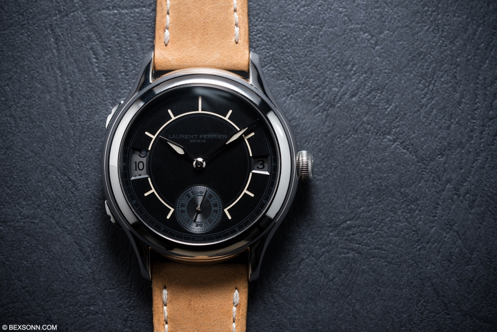 The second model in the Boréal range is the Galet Traveller which we covered here if you want to read more about the actual movement and case. As with the Galet Square, the Traveller retains its LF Calibre 230.01 micro rotor movement, also with a double direct impulse escapement. The treatment is largely the same as the Galet Square, with the sector dial filled with super-luminova and the grey satin brushed dial. The wheels in the apertures for the travel time on this piece are similar in colour to the dial, a lighter shade of grey which sits back and allows the main design aspect of the watch to take centre stage without clashing: the super-luminova sector.
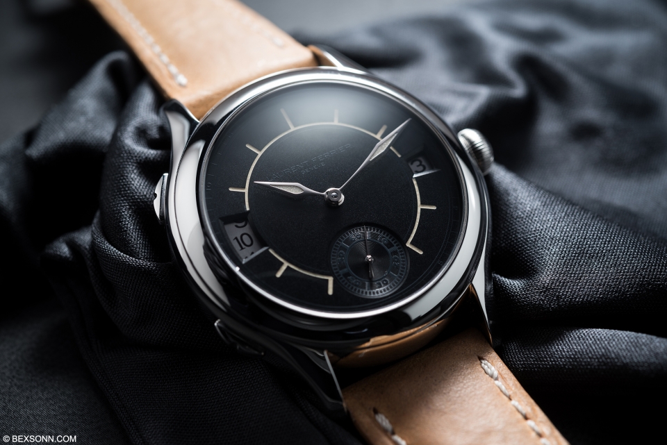 I have always been a fan of how Laurent Ferrier manages to create a strong relationship between the shape of the hands and the style of the dial, something that seems intuitive, is not that easy to achieve. The Boréal range was certainly executed with thought and while I must say, I still prefer the old style of the markers and Assegai hands, I can see how it all works and can fully appreciate the design elements. I often scowl at loud watches and the Boréal range certainly is with the thick sector dial. But what impresses me is the respect to design Laurent Ferrier has shown. Sure, they have gone for showy aesthetics with the sector, but they made sure to balance it out with the subtlety of the blacked out logo and grey aperture wheels for the Galet Traveller, ensuring the balance remains at all times. Oh, and did I mention, one big difference for the two pieces is that they are production pieces in stainless steel? To some, that is a pretty big deal.
For more information on the new Galet Boréal range, visit the official Laurent Ferrier website.
